
A Reminiscer's Walk

On Tuesday, my husband, one of my daughters, and I drove to my parent’s home in Hacienda Heights, California to help them while my father is staying in Baldwin Park Hospital. He has dipped into a fog and can have bouts of confusion, thinking he is in a play (he used to be a high school drama teacher) but in most ways he is still his same self and sometimes recollects lovely memories from his life. I am sitting next to his bed as I write this.
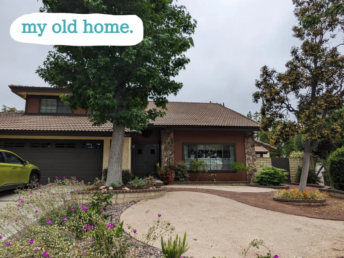

The home that my parents currently live in is the home I lived in from ages eight to sixteen. This home is marked with the number 1 on the map and will be called, my old home. There is another home that is 1.3 miles away that was the home we all lived in when I was three to eight years old. This one is marked number 8 on the map and will be called, my older home. Wednesday morning I took this walk with the eye of a reminiscer.
Along my walk I snapped photos and later drew in my memories in blue. Number 2 on the map marks where Marie Luna and I played Barbies for the last time near her parent’s front yard fountain.

Number 3 on the map marks where I would stop and peek through the fence to see the white llama that resided there. This time I could only see a white truck.

Number 4 on the map marks where the tall metal space ship used to be. I wonder how tall it really was because it seemed like a skyscraper at the time. It even had a captain’s steering wheel and escape slide. My sister and I would stand in the top, grip the bars, and shake as hard as we could to get the ship to rock back and forth. There was also a 1960’s looking concrete sculpture that we would pretend was the moon. Now the park has a playground with newer, safer equipment.

At this same park there was a building with a many arched roof that my brother somehow got on top of. For a while I watched in envy as he ran back and forth over those arches until all of the sudden, basketballs, pink plastic balls, tennis balls, and a volleyball came raining down. He kicked an accumulation of many years worth off the roof. Sweet manna from heaven, I felt like we had won the lottery.

Number 6 on the map is the very memorable tall curb I had to climb up every day I walked to school. Today it goes up to my knees.

Number 7 on the map is the hill that we could see from my older house. I remember hearing rumors that there was a wild man that lived up there that survived off of eating mustard seed flowers. Being a child, I believed.

The last memory on my walk occurred at number 8 on the front lawn of my older home. This memory, I created a full illustration for. I remember my father showing me Halley’s Comet. It was twilight and he was pointing up into the sky. I don’t have a memory of actually seeing the comet, but I remember him telling me, “You will be eighty two when you see it again.”

A map for the reminiscing is a very specific map for the individual. Even one of my siblings could do the same walk and have completely different places and stories to note. A nice vigorous walk usually leaves the walker with an energized view of the future, but a walk with a reminiscent eye can leave the walker with a wistful view of time passing.